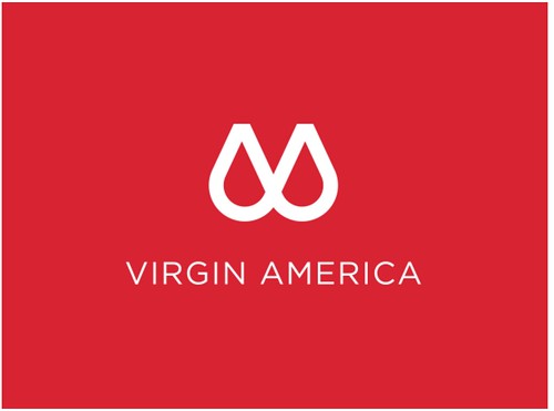
Virgin America unveiled its new logo today. No, it's not April Fool's Day. That is tomorrow. Yes, their new logo looks like... a sports bra. UPDATE: But upon looking closer at the story and the video... it does seem like a parody.
Here's how they describe it:
Ultimately, every stroke of our new logo represents the essence of who we are – and what we mean to people. The combination of sharp angles and sleek, sexy, supple curves are meant to surprise and delight upon repeat views – but also highlight humanity’s inherently contradictory nature, the yin and yang, the id and the ego, the fact that sometimes we want to stay connected and work with fleetwide WiFi, and sometimes we want to just kick back and relax with on-demand entertainment, food and drink.
"Sexy, supple curves."
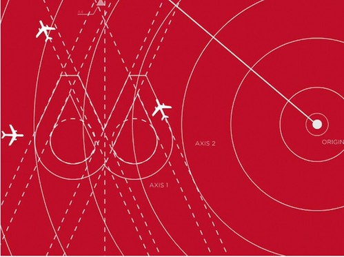
Starting from the top and working our way to bottom, the first things that you’ll notice are the angular shapes protruding from the pinnacle of the logo. These isosceles triangles – triangles that have two sides that are the same length are meant to highlight our product consistency and the fact that we have both an amazing product and service on every flight, every time.
The two prominently displayed half circles represent both our tech-forward innovation on the one hand – and our supportive approach to guest care on the other. By connecting the two half circles, we’re making it clear that they are inextricably linked. You simply cannot have one without the other. To achieve the look and feel, a team of 15 designers spent over 2,500 hours perfecting the precise shape of the circles. In fact, if you look closely, you’ll see that each circle is designed to mimic the nose of our Airbus A320 aircraft. To achieve this effect, Connor had us physically remove the entire nose and flight deck of one of our aircraft. The 14 ton section was then lifted with a crane on to a giant sheet of paper the length of an entire football field, at which point Connor traced the shape with a charcoal pencil to achieve the thick, bold lines you see bordering the logo.
That's quite a bit of work... and money... to honestly fix a logo that wasn't broken. So is it real? I'm now guessing not. Nonetheless, I guess we'll find out tomorrow.


No comments:
Post a Comment