instagram

Showing posts with label Donald Sterling. Show all posts

Sunday, May 4, 2014

Is This FINALLY The End of Donald Sterling's Tasteless Los Angeles Times Ads?


As the Donald Sterling/Clippers/Racism/V. Stiviano mess continues, here's one positive byproduct: Our Long National Nightmare of horrid Sterling ads in the Los Angeles Times appears to be over.

No horribly designed and self-congratulatory Sterling ad appears in today's Sunday paper, where they're normally hard to avoid. Instead, the Times digs deep into the ads and discovers what I think most of us had already figured out a long time ago: Those ads are mostly bull$#!+. Promises of grand facilities to help the homeless or poor kids are all talk. Donations aren't as big as Sterling claims. And those ads featuring a yearbook-style parade of community leaders, all seemingly supporting Sterling, are printed without those leaders' consent.

A highlight from the Times' story:

Ads bearing the name of the Sterling Foundation have heavily promoted its namesake's good works. Those in the Los Angeles Times have featured pictures of the billionaire Clippers owner and numerous recipients of his largesse, including leaders of groups that serve minorities and the underprivileged.

Some of the ads said the foundation was committed to making $10 million in donations. Others cited larger figures — $17 million, even $20 million.

The foundation's actual giving has been far more modest than the publicity suggests.

And some of Sterling's most touted projects, such as the Malibu children's camp and earlier plans for a skid row homeless center, have so far failed to materialize.

From 2009, when Sterling began funding the foundation, through the end of 2012, it gave out about $1.4 million, according to tax records.

Most were grants of $5,000 to $20,000 to dozens of community groups and schools, including Para Los NiƱos, the United Negro College Fund and the Union Rescue Mission.

Some organizations that received the foundation's money said they were grateful. But others said they became turned off by what they considered Sterling's relentless self-promotion, even before the NBA banned the Clippers owner for life last week for a recording in which a man the league said was Sterling told a female friend not to associate with black people in public.
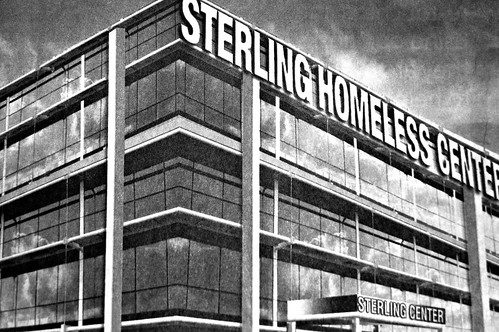
The story doesn't address the offensive design of these terrible-looking ads. But Sterling's claims and his bad taste go hand in hand: For example, his ads touting his funding a new homeless shelter included this image of what the shelter was going to look like:

Sterling Homeless Center

(Thanks to Eric the Atwater Village Newbie a.k.a. Pedestrian Photographer for the image!) I mean, that's not only an ugly design for a building, but the drawing is all off. It would be impossible to even construct a building that looked like this. Such a half-assed design should have been the leading indicator that this was one big joke.

Previously on Franklin Avenue:

Donald Sterling Ropes Marilyn Monroe Into His Assault on Good Design (December 2013)

Donald Sterling Does It Again, Bends The Species Rules (June 2012)

Latest Sterling Ad: Too Cheap for Photo Rights? (February 2012)

Donald Sterling Expands His War Against Good Taste (December 2010)

Another Side of the Donald Sterling Ads (June 2009)

Donald Sterling's Floating Apartment Building -- And Other Photoshop Offenses (May 2009)

Donald Sterling Ads: Homeless? (August 2008)

Donald T. Sterling Discriminates Against Grammar (February 2008)

Donald T. Sterling is Looking For a Few "California-Type" Models (August 2007)

Is It Possible? Donald T. Sterling Ads, Worse Than Ever? (March 2007)

The Ugliest Newspaper Ads in the World (January 2007)

Monday, December 16, 2013

Donald Sterling Ropes Marilyn Monroe Into His Assault on Good Design

Donald Sterling

Donald Sterling, what have you done?

As seen in this week's Los Angeles Times. We're used to the oversized, blurry, poorly cropped photos of Sterling in his obnoxious and horribly designed ads. So when "Marilyn" took the place of Sterling in this ad, it was rather jarring. I have no idea what's going on here.

Not familiar with Sterling's assault on good design? Here's a classic:


We've been ranting about Sterling's L.A. Times ads for years. Previously on Franklin Avenue:

Donald Sterling Does It Again, Bends The Species Rules (June 2012)

Latest Sterling Ad: Too Cheap for Photo Rights? (February 2012)

Donald Sterling Expands His War Against Good Taste (December 2010)

Another Side of the Donald Sterling Ads (June 2009)

Donald Sterling's Floating Apartment Building -- And Other Photoshop Offenses (May 2009)

Donald Sterling Ads: Homeless? (August 2008)

Donald T. Sterling Discriminates Against Grammar (February 2008)

Donald T. Sterling is Looking For a Few "California-Type" Models (August 2007)

Is It Possible? Donald T. Sterling Ads, Worse Than Ever? (March 2007)

The Ugliest Newspaper Ads in the World (January 2007)

Monday, June 11, 2012

Donald Sterling Does It Again, Bends The Species Rules

Donald Sterling ad

As you know, we celebrate Donald T. Sterling's L.A. Times ads as the worst photoshopped newspaper ads in the world. There's plenty of evidence to back that up, just look at our roundup of past Donald Sterling blog posts here.

Last time we mentioned a Sterling ad, it was because his graphic designer hadn't even bothered to buy the rights to a stock photo, and instead slapped a photo watermarked with "STOCK PHOTO" wording still on the photo!

But at least past portrayals of Donald T. Sterling -- always a blurry, blown-out-of-proportion shot of him -- have suggested he was human. But looking at today's L.A. Times ad, I'm impressed that Sterling has finally come out as a Centaur -- half man, half horse. Congrats!

Friday, February 17, 2012

Latest Sterling Ad: Too Cheap for Photo Rights?

Sterling ad

The Clippers are finally giving fans something to cheer about, which is quite a change for much-maligned owner Donald Sterling. But for fans of good design, Sterling is still Public Enemy No. 1.

Eagle-eyed reader John noticed this recent Sterling ad, in which the designers didn't even bother to license an actual stock photo (or hell, just take one themselves). Nope, this ad, for Sterling's Beverly Hills Plaza Hotel, includes an unlicensed stock image with the watermark "STOCK PHOTO" still stamped on it. Classy!

Sterling's horrific ads are legendary, of course, and I think he wears the badness as a badge of honor. I'm just surprised that the ad above doesn't include an awkwardly large, horribly trimmed and WAY out of focus shot of Sterling in a tux -- his signature design touch.

We've been ranting about Sterling's L.A. Times ads for years. Previously on Franklin Avenue:

Donald Sterling Expands His War Against Good Taste (December 2010)

Another Side of the Donald Sterling Ads (June 2009)

Donald Sterling's Floating Apartment Building -- And Other Photoshop Offenses (May 2009)

Donald Sterling Ads: Homeless? (August 2008)

Donald T. Sterling Discriminates Against Grammar (February 2008)

Donald T. Sterling is Looking For a Few "California-Type" Models (August 2007)

Is It Possible? Donald T. Sterling Ads, Worse Than Ever? (March 2007)

The Ugliest Newspaper Ads in the World (January 2007)

(Thanks to Franklin Avenue reader John for the tip!)

Thursday, December 23, 2010

Donald Sterling Expands His War Against Good Taste


We've written plenty in the past about Donald Sterling's newspaper ads, an assault on the eyes and a jumbled, photoshopped mess seemingly created by the world's first-ever blind graphic designer. (A website is even devoted to the offensive ads.)

But rather than be shamed into hiring a designer with elementary computer skills, the Sterling ad team is now mocking us. They appear to be upping the bad, looking to see how far they can thumb their nose at anyone with a modicum of taste.

My favorite cheesy staple of the Sterling ads has to be the fake buildings, complete with half-assed lettering superimposed on the building's front. In case you didn't figure it out by now, there's no real Greek revival-style "Sterling Foundation" building.

Stay classy, Donald Sterling!

Monday, June 15, 2009

Another Side of the Donald Sterling Ads


We've written often of Donald T. Sterling's painfully horrible print ads that regularly appear in the L.A. Times.

The ads are known for recurring features such as the same large, blurry photo of Sterling; horrible photoshopped images; poor grammar; unusual mixtures of fonts; and strange claims.

Sterling refuses to hire a professional to design his ads; as a matter of fact, it seems like he celebrates the fact that his ads are horrible. The more that people write about the ads, the more Sterling & Co. seem resigned to pissing off readers by keeping them as is.

That's why I was surprised to see, for the first time in years, a different image of Sterling in one of his ads on Sunday:


Yep, that's Sterling, wearing what appears to be a jacket from his prep school days, holding the gaudiest, most gigantic trophies you've ever seen. The ad is for something that Sterling has cooked up called the "Sterling Charity Excellence Awards."

Now, I don't know how legit these awards are, or if they're in the vein of his so-called "Sterling Homeless Center" -- which has so far not been proven to even exist. In the ad, Sterling says 20 charities have been given $1 million in grants. (And, I suppose, one of those tremendously ugly trophies.)

But hey, this is a big moment: The ad may be as ugly as ever, but at least they were finally able to use a new photo of the Man Who Murdered Good Design.

Monday, May 11, 2009

Donald T. Sterling's Floating Apartment Building -- And Other Photoshop Offenses


Those animals with rudimentary photoshop skills over at Donald T. Sterling headquarters are at it again. And I do mean "animals," as I'm convinced Sterling employs a group of chimps (who fetch small salaries and don't demand a comprehensive health care plan, after all) to design all of his print advertisements.

No self-respecting human being, after all, would cop to designing Sterling's newspaper ads, which murder my eyeballs every time I see them. (Read my myriad of posts on Sterling's horribly designed ads here.) I'm not the only one; the Donald T. Sterling Graphic Design Foundation was created in an effort to stop Sterling's offensive ads.

These days, however, I'm convinced that Sterling is well aware that his ads are horrible -- and has made it his goal to make the ads even more ridiculous. The end game, other than taking pleasure in pissing us all off? I dunno.

But this ad above? Let's count the ways this reaches out and waterboards your sight. The building floating on the ocean. The giant 50 ft. woman who clearly doesn't slum it in that building. The horribly cut and pasted building name. If there's one thing going for this ad, it's the simple fact that Sterling's signature blurry, blown out-of-proportion mug shot is nowhere to be seen here.

Friday, August 1, 2008

Donald T. Sterling Ads: Homeless?


Last Sunday, the Los Angeles Times published its final-ever Real Estate section -- a section that, the paper noted, had been a Sunday staple since 1901.

The big question no one asked at the time, however: What will become of the Ugliest Newspaper Ads in the World?

For years, Donald T. Sterling's absolutely dreadful full-page ads have been a part of the Real Estate section (reportedly because the mogul received bottom-basement rates) -- offending readers' taste and angering anyone with any sense of design -- including this guy.

I'd already noticed that the Sterling ads have been appearing less frequently -- now, where will they go?

Tuesday, February 19, 2008

Donald T. Sterling Discriminates Against Grammar


Just when you think those horrible Donald T. Sterling ads couldn't get any worse... they do.

Check out this ad from Sunday's Los Angeles Times. Not only is it visually offensive, but it's grammatically painful as well.

"DONALD T. STERLING HAS CHECK FOR YOU." Has Sterling gone caveman on us? Does he no longer have time for articles like "a" and "the"? What's the follow-up conversation? "DONALD T. STERLING LIKE BUY YOUR BUILDING FOR DIRT CHEAP PRICE. SELL NOW, OR DONALD T. STERLING BUY BUILDING FOR CHEAPER PRICE AT FORECLOSURE AUCTION."

I'm thinking Sterling's people purposely now are trying to make their LAT ads as ugly as possible, just to piss off these folks.

Tuesday, August 28, 2007

Donald T. Sterling Is Looking For A Few "California-Type" Models


Spotted in Sunday's L.A. Times. What, pray tell, does "California type" actually mean? And how do you illustrate that on a resume?

Meanwhile, when they say they're looking or someone "outgoing, cheerful and professional," ahem, what do they mean?

Well, good luck to ya.