instagram

Showing posts with label Design. Show all posts

Sunday, May 4, 2014

Is This FINALLY The End of Donald Sterling's Tasteless Los Angeles Times Ads?


As the Donald Sterling/Clippers/Racism/V. Stiviano mess continues, here's one positive byproduct: Our Long National Nightmare of horrid Sterling ads in the Los Angeles Times appears to be over.

No horribly designed and self-congratulatory Sterling ad appears in today's Sunday paper, where they're normally hard to avoid. Instead, the Times digs deep into the ads and discovers what I think most of us had already figured out a long time ago: Those ads are mostly bull$#!+. Promises of grand facilities to help the homeless or poor kids are all talk. Donations aren't as big as Sterling claims. And those ads featuring a yearbook-style parade of community leaders, all seemingly supporting Sterling, are printed without those leaders' consent.

A highlight from the Times' story:

Ads bearing the name of the Sterling Foundation have heavily promoted its namesake's good works. Those in the Los Angeles Times have featured pictures of the billionaire Clippers owner and numerous recipients of his largesse, including leaders of groups that serve minorities and the underprivileged.

Some of the ads said the foundation was committed to making $10 million in donations. Others cited larger figures — $17 million, even $20 million.

The foundation's actual giving has been far more modest than the publicity suggests.

And some of Sterling's most touted projects, such as the Malibu children's camp and earlier plans for a skid row homeless center, have so far failed to materialize.

From 2009, when Sterling began funding the foundation, through the end of 2012, it gave out about $1.4 million, according to tax records.

Most were grants of $5,000 to $20,000 to dozens of community groups and schools, including Para Los NiƱos, the United Negro College Fund and the Union Rescue Mission.

Some organizations that received the foundation's money said they were grateful. But others said they became turned off by what they considered Sterling's relentless self-promotion, even before the NBA banned the Clippers owner for life last week for a recording in which a man the league said was Sterling told a female friend not to associate with black people in public.
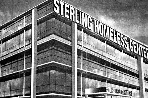
The story doesn't address the offensive design of these terrible-looking ads. But Sterling's claims and his bad taste go hand in hand: For example, his ads touting his funding a new homeless shelter included this image of what the shelter was going to look like:

Sterling Homeless Center

(Thanks to Eric the Atwater Village Newbie a.k.a. Pedestrian Photographer for the image!) I mean, that's not only an ugly design for a building, but the drawing is all off. It would be impossible to even construct a building that looked like this. Such a half-assed design should have been the leading indicator that this was one big joke.

Previously on Franklin Avenue:

Donald Sterling Ropes Marilyn Monroe Into His Assault on Good Design (December 2013)

Donald Sterling Does It Again, Bends The Species Rules (June 2012)

Latest Sterling Ad: Too Cheap for Photo Rights? (February 2012)

Donald Sterling Expands His War Against Good Taste (December 2010)

Another Side of the Donald Sterling Ads (June 2009)

Donald Sterling's Floating Apartment Building -- And Other Photoshop Offenses (May 2009)

Donald Sterling Ads: Homeless? (August 2008)

Donald T. Sterling Discriminates Against Grammar (February 2008)

Donald T. Sterling is Looking For a Few "California-Type" Models (August 2007)

Is It Possible? Donald T. Sterling Ads, Worse Than Ever? (March 2007)

The Ugliest Newspaper Ads in the World (January 2007)

Friday, September 6, 2013

A Rebuttal to The Atlantic Wire: Good Design Doesn't Matter?

Atlantic Wire

Yesterday in The Atlantic Wire, Rebecca Greenfield wrote:

One would think that with all the intense outrage over Yahoo's new logo that this is the most cared about logo to ever grace our eyes, but it's not. Just a few of years ago, the new Gap logo evoked more ire than it deserved. The anger got so extreme that the clothing company reverted back to the old look. This happens often: The public gets very upset over something that matters not at all. Maybe the new Yahoo design is "dull, uninspiring and limp," as one critic put it, but does it mean anything? No. But everyone gets all worked up because they have the facilities to do so in a somewhat astute (sounding) manner — a phenomenon known as the "Bikeshed Effect."


First off, I must admit, I was flattered that Franklin Avenue's critique was singled out. But...

I must say, Greenfield's post was a bit of an overreaction to the overreaction. We live in a social media world where everyone reacts with intense outrage to everything. Miley twerking. The boiling temperature in Southern California today. The latest crazy thing to come out of Pat Robertson's mouth. The cancellation of "Happy Endings." Do any of these things matter? Yes and no. They matter to people in the moment, and isn't that all that matters?

Everyone has something they care about. You may be pissed off at an NFL trade that I have no idea about. I may be pissed off at MTV for naming a song of the summer that is so clearly not the song of the summer because, you know what, that does matter to me. In my world, a world in which I grew up obsessing over the Billboard Hot 100 and even printing out my own Top 30 music chart every week (what? Yes, I didn't just collect TV Guides), stupid stuff like that matters. And am I going to voice my opinion? Yes, because I care that much. I really do. (And sorry MTV, but a terrible One Direction song that has just been released can not, under any logical argument, be considered the 2013 song of the summer.)

That brings us to the Yahoo! redesign. Why do I care so much? Well, I care about things like logos, typography, fonts and good graphic design. I've been obsessed with these things all my life. I even married a graphic designer. I grew up printing fake newspapers (yep, not just music charts and TV Guide collecting for this guy!) mostly because I loved the idea of how publications were laid out. I obsess over logos, enjoy looking at old examples and have even designed my own through the years (for my college radio station, among others). So when I see what I *know* to be a bad logo, and I consider the amount of time, money and energy that went into that bad logo, I want to vent. Thanks to social media, now I can. On this blog. On Twitter. I know Yahoo! has no interest in what I think. But at least I got it off my chest, and have been able to share in my disgust with others. (That's what social media is about, after all. A community.)

My AT&T U-verse email goes through Yahoo!, as does our Franklin Avenue email. Which means I have to look at that logo several times a day. And every time I look at that new logo, with its thin letters, I wonder why. Why a major new media company like Yahoo! would go for a logo that was so faint, so dull and so uninspiring. It especially looks faint next to the bolder, thicker (and yet, uncapitalized) logo of AT&T, an ancient company that has nonetheless been able to effectively rebrand itself.

Yahoo!'s original logo was not amazing, but it had a lot more character than this one. I could even hear the famous trademark yodel in my head when I glanced at the old logo. This one looks like a logo that might have been designed for a medium-sized city's public library.

So yes, I think logos mean something. Design means something, just as architecture means something and art means something. It may not be discussing "How Will Yahoo Increase CPM's Given Current Trends in Digital Advertising?" -- but that's an evergreen topic. It's not something that incites passion. I'M ANGRY OVER YAHOO'S CPMS. No. Not the same thing. With the logo, we're discussing something that just happened -- hence all the sudden pouring of haterade. It's a physical, noticeable change that you can put your arms around (in this case, to suffocate it to death.) And someone has to say something. That's why there are literary critics. Book critics. TV critics. Film critics. Art critics. Architecture critics. And yes, design critics. When a major corporation undergoes a major rebrand, and comes up with something so limp, I think they need to hear from us. They need to know that they can do better.

Now if you'll excuse me, I'm off to check my Yahoo! email. While containing my anger.

A few more good reads on the topic:

Yahoo's Logo Reveals the Worst Aspects of the Engineering Mindset (Glog)
Yahoo’s new logo and the 30-day punchline (ARS Technica)

Saturday, December 22, 2012

Los Angeles Things That Were Never Built


There are things that are up my alley, and then things that are really up my alley. And this is one of them. LA Observed has the skinny on "Never Built: Los Angeles," a proposed 2013 event at the A+D Architecture and Design Museum on Wilshire. The exhibit combs through countless designs and announcements of grandiose projects that ultimately were never built in Los Angeles. Kevin at LA Observed has the details:

Sam Lubell, the West Coast Editor of the Architect’s Newspaper, and Greg Goldin, the architecture critic at Los Angeles Magazine, have mined the landscape and found some real gems. Lloyd Wright's incredibly grand 1925 Civic Center for downtown. Or the 1952 master plan for LAX by architects Pereira and Luckman. The plan is to use the research to mount an ambitious exhibition next spring at the A+D Architecture and Design Museum on Wilshire. They have launched a Kickstarter campaign to make it happen, and of course you can help.


Here's a link to the Kickstarter. You know I'm in!

Monday, July 2, 2012

Celebrating Design at Chinatown's Chung King Alley

Chinatown Design night

Chinatown's Chung King Alley has transformed in recent years as a new generation of galleries moved in alongside the old-school antique shops and restaurants. We took the Gold Line to Chinatown on Saturday to check out the 2nd Annual Chinatown Design Night, part of the Los Angeles Design Festival.

Among the highlights that we saw, as noted by the LA Design Festival website:

Coagula Curatorial - Cartoonist Jim Caron will be hosting a book signing for his latest work “I AM NOT A TYPO.”

Fifth Floor - C-town’s resident purveyor of accoutrements for the modern life will be showcasing a new collection of letterpress and screen prints by LA artists Charlie Carroll, David Lomeli, and Leslie Ross-Robertson.

Flock Shop – Featuring the appropriately-named new collection The End is Only the Beginning, with the work of 13 participating artists from around the world.

Strangeways Academy – This collaborative graphic design studio will be opening its doors to show Sound Codes, a new collection of work by Amy Fortunato and Lee Noble.

Preen – If you missed this creative brood on the de LaB design-n-dim-sum ride, this is open house and another opportunity to check out their outstanding interior design and architecture studio.

Osceola Refetoff - Pop into this photography studio to check out a new interactive light sculpture by Leif Maginnis called ArtStrobe.


Some highlights from our night in Chinatown:

Chinatown Design night
The new Exhale Unlimited gallery opens with a mission: Everything at this Saturday's exhibition came from artists who are either homeless or disabled.

Chinatown Design night
At the Exhale gallery: Reps from the Waterbar LA brand of flavored waters -- among them, Apple Pie water and PB&J water -- showed off their product.

Chinatown Design night
Dancers from "Versa Style" perform outside the Exhale Unlimited gallery.

Chinatown Design night
The scene at Fifth Floor Gallery

Chinatown Design night
Two letterpressed works by Leslie Ross-Robertson: "Pan Pacific" and "Casestudy View"

Chinatown Design night
Two screenprints by David Lomeli: "Hip" and "I Love L.A."

Chinatown Design night
While most of the storefronts on Chung King Road are now art galleries, Fong's (which imports Chinese artwork) remains.

Chinatown Design night
The Happy Lion gallery

Chinatown Design night
L.A. graffiti crew West Coasts Artists, which began back in 1985, has never had a full-fledged art exhibit -- until now. We checked out the show on Saturday during the design show; read more about it here.

Chinatown Design night
"Good Times" at the West Coasts Artists show.

Chinatown Design night
More art!

Chinatown Design night
"Forgive me for being a hypocrite."

Chinatown Design night
"America, the Greatest Nation on Earth"

Chinatown Design night
"Father, Mother, Sister, Brother."

Chinatown Design night
"How to Destroy LA."

Chinatown Design night
Blogger Toddler 2.0 enjoys "Private Property."

Chinatown Design night
"If Only You Were Better."

Chinatown Design night
Performance art!

Chinatown Design night
The three-prong claw!

Chinatown Design night

Chinatown Design night

Chinatown Design night

Chinatown Design night

Friday, February 17, 2012

Latest Sterling Ad: Too Cheap for Photo Rights?

Sterling ad

The Clippers are finally giving fans something to cheer about, which is quite a change for much-maligned owner Donald Sterling. But for fans of good design, Sterling is still Public Enemy No. 1.

Eagle-eyed reader John noticed this recent Sterling ad, in which the designers didn't even bother to license an actual stock photo (or hell, just take one themselves). Nope, this ad, for Sterling's Beverly Hills Plaza Hotel, includes an unlicensed stock image with the watermark "STOCK PHOTO" still stamped on it. Classy!

Sterling's horrific ads are legendary, of course, and I think he wears the badness as a badge of honor. I'm just surprised that the ad above doesn't include an awkwardly large, horribly trimmed and WAY out of focus shot of Sterling in a tux -- his signature design touch.

We've been ranting about Sterling's L.A. Times ads for years. Previously on Franklin Avenue:

Donald Sterling Expands His War Against Good Taste (December 2010)

Another Side of the Donald Sterling Ads (June 2009)

Donald Sterling's Floating Apartment Building -- And Other Photoshop Offenses (May 2009)

Donald Sterling Ads: Homeless? (August 2008)

Donald T. Sterling Discriminates Against Grammar (February 2008)

Donald T. Sterling is Looking For a Few "California-Type" Models (August 2007)

Is It Possible? Donald T. Sterling Ads, Worse Than Ever? (March 2007)

The Ugliest Newspaper Ads in the World (January 2007)

(Thanks to Franklin Avenue reader John for the tip!)

Wednesday, January 25, 2012

On Pacific Standard Time: LACMA's California Design Exhibit

LACMA

As part of the citywide Pacific Standard Time exposition of California mid-20th Century art and design, LACMA's Resnick Pavilion is currently showcasing "California Design, 1930-1965: Living in a Modern Way," an interesting cross-section of the state's influential modern design from that era. Details:

This exhibition is the first major study of California midcentury modern design. With more than 300 objects—furniture, ceramics, metalwork, fashion and textiles, and industrial and graphic design—the exhibition examines the state’s role in shaping the material culture of the entire country. Organized into four thematic areas, the exhibition aims to elucidate the 1951 quote from Ć©migrĆ© Greta Magnusson Grossman that is incorporated into the exhibition’s title: California design “is not a superimposed style, but an answer to present conditions…It has developed out of our own preferences for living in a modern way."


We visited the exhibit on the same day we checked out the Broad Contemporary Art Museum and the "Metropolis II" exhibit. Some pics from "California Design":

LACMA
Vintage Airstream streamline trailer

LACMA

LACMA

LACMA
Studebaker's 1962 sports car Avanti

LACMA
Album covers

LACMA
Ceiling light from Barton's Bonbonniere candy shop in San Francisco, circa 1952. (Victor Gruen, designer)

LACMA
Modern furniture

LACMA
Mattel and Barbie are a sponsor of the exhibit, hence the mid-century Barbie dolls on display

LACMA
Barbie's mid-century dream house, circa 1962

LACMA
Wartime poster

LACMA
Table from the sportswear department at Bullock's Wilshire, designed by Jock D. Peters

LACMA
Screen (with a cool atomic, space age feel), cira 1952, designed by Greta Magnusson Grossman.

LACMA
"Rib chair," designed by Arthur Espenet Carpenter in 1968.

Tuesday, December 13, 2011

Best Product Packaging Ever? Japanese Popsicles

Japanese popsicles Apparently the Gari Gari Kun Soda-flavored popsicles are very popular -- and I'm sure they're delicious. But you gotta credit the packaging and marketing as well. According to this website, "Gari Gari Kun" can be translated to "Crunchy Boy." OK, that's odd. But still looks delicious.

Monday, November 7, 2011

Franklin Avenue's Fresh Coat of Paint


It was about time. Thanks to Maria for giving Franklin Avenue a much-needed facelift over the weekend. We're still working out a few bugs -- including the fact that we're now using Blogger's comments system, which means all of our old comments are no longer on the blog. At least for now. They're still stored away in our Haloscan account, and maybe we'll figure out a way to bring them back.

Thanks for continuing to check out Franklin Avenue, as we celebrate our ninth blog-iversary in March. Here's a glimpse at how the blog has evolved over the years, starting with our initial look in 2003: